PubMed publications in 2011 by 202 world countries: who’s the winner?
Introduction
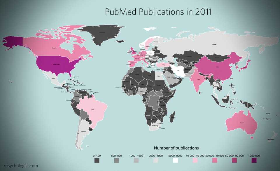
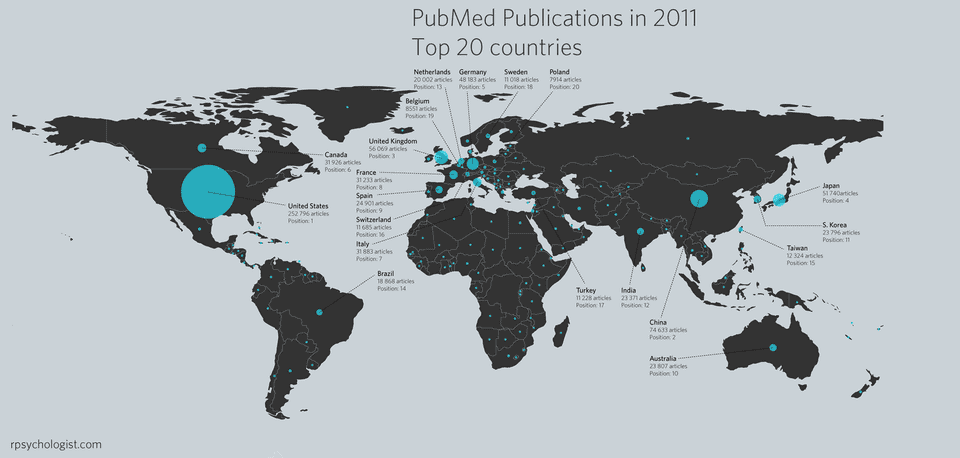
I had this idea that it’d be fun to look at all PubMed’s articles from 2011 and extract country affiliation for each individual country. So I set out to do just that, but in addition to just look at 2011 I also looked at proportional change in publication 1980–2010 for the top 20 countries. The data for 2011 is visualized on a world map both as a bubble plot and as a heat map.
It turned that this project weren’t as straightforward as I first had anticipated. Mainly because PubMed’s affiliation field is a veritable mess with no apparent reporting standard. I imagine there are databases who are much more suited to this task than PubMed.
Method
There were 986 427 articles published in PubMed in 2011; so I,
naturally, used R to extract national publication counts. I did this by
downloading all citations into one 8.37 Gb XML-file, imported the
affiliation strings into MySQL and then used R to extract country
affiliation using grep and regular expressions.
To avoid unnecessary manual work I used lists of country names, U.S state & university names, India states and Japan universities. I also looked at word frequencies for the affiliations strings that couldn’t be matched, and used this to make additional pattern lists. Lastly, I also used mail-suffixes to extract affiliation.
Reliability
To find out how many mismatches my script perfomed, I drew a random sample (n = 2000) and manually screened for errors. 22 errors were found, and all of them entailed the string being matched to the correct country plus one incorrect country, i.e. this string were matched to both UK and US (because “Bristol” is matched to UK):
Department of Biotransformation, Bristol-Myers Squibb, Route 206 and Province Line Road, Princeton, NJ 08543, USA. anthony.barros@bms.com
It’s not really a big problem since it only occurs in 1.1 % of the sample. The following countries had erroneous extra matches in my random screening sample:
Moreover 1.8% of the affiliation strings couldn’t be matched to any country, by analyzing the word frequencies for the unmatched strings, I concluded there didn’t appear to be any words that could be used to identify an significant amount of countries.
Additionally, I compared the number of hits for my top 20 countries to the corresponding hits when searching PubMed using rudimentary country queries. These were the results:
The measurement error is a bit high in countries like Poland, Switzerland and Spain. Nonetheless, I decided to use these PubMed quires to look at annual publications for these countries 1980–2010, using my PubMed trend script
Results
In total 202 countries were extracted, with the publication distribution looking like this:
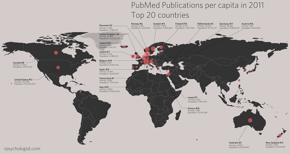
The same plot as above, but with the bubble size representing publications per capita.
And a plot of the top 20 countries publication percentages 1980–2010
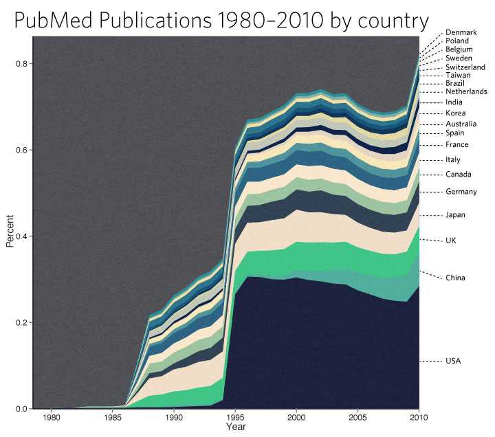
PS 1. Thanks to Allan Just for telling me how to extract centroid values from the country polygons.
PS 2. My plan is to do some more in-depth analyzes if this data, e.g. to look at publications per capita (in a vain attempt to increase Sweden’s rankings) and some traditional statistical analysis. Update: Publications per capita added.
Written by Kristoffer Magnusson, a researcher in clinical psychology. You should follow him on Twitter and come hang out on the open science discord Git Gud Science.
Published May 07, 2012 (View on GitHub)
Buy Me A Coffee
A huge thanks to the 152 supporters who've bought me a 361 coffees!
Jason Rinaldo bought ☕☕☕☕☕☕☕☕☕☕ (10) coffees
I've been looking for applets that show this for YEARS, for demonstrations for classes. Thank you so much! Students do not need to tolarate my whiteboard scrawl now. I'm sure they'd appreciate you, too.l
JDMM bought ☕☕☕☕☕ (5) coffees
You finally helped me understand correlation! Many, many thanks... 😄
@VicCazares bought ☕☕☕☕☕ (5) coffees
Good stuff! It's been so helpful for teaching a Psych Stats class. Cheers!
Dustin M. Burt bought ☕☕☕☕☕ (5) coffees
Excellent and informative visualizations!
Someone bought ☕☕☕☕☕ (5) coffees
@metzpsych bought ☕☕☕☕☕ (5) coffees
Always the clearest, loveliest simulations for complex concepts. Amazing resource for teaching intro stats!
Ryo bought ☕☕☕☕☕ (5) coffees
For a couple years now I've been wanting to create visualizations like these as a way to commit these foundational concepts to memory. But after finding your website I'm both relieved that I don't have to do that now and pissed off that I couldn't create anything half as beautiful and informative as you have done here. Wonderful job.
Diarmuid Harvey bought ☕☕☕☕☕ (5) coffees
You have an extremely useful site with very accessible content that I have been using to introduce colleagues and students to some of the core concepts of statistics. Keep up the good work, and thanks!
Michael Hansen bought ☕☕☕☕☕ (5) coffees
Keep up the good work!
Michael Villanueva bought ☕☕☕☕☕ (5) coffees
I wish I could learn more from you about stats and math -- you use language in places that I do not understand. Cohen's D visualizations opened my understanding. Thank you
Someone bought ☕☕☕☕☕ (5) coffees
Thank you, Kristoffer
Pål from Norway bought ☕☕☕☕☕ (5) coffees
Great webpage, I use it to illustrate several issues when I have a lecture in research methods. Thanks, it is really helpful for the students:)
@MAgrochao bought ☕☕☕☕☕ (5) coffees
Joseph Bulbulia bought ☕☕☕☕☕ (5) coffees
Hard to overstate the importance of this work Kristoffer. Grateful for all you are doing.
@TDmyersMT bought ☕☕☕☕☕ (5) coffees
Some really useful simulations, great teaching resources.
@lakens bought ☕☕☕☕☕ (5) coffees
Thanks for fixing the bug yesterday!
@LinneaGandhi bought ☕☕☕☕☕ (5) coffees
This is awesome! Thank you for creating these. Definitely using for my students, and me! :-)
@ICH8412 bought ☕☕☕☕☕ (5) coffees
very useful for my students I guess
@KelvinEJones bought ☕☕☕☕☕ (5) coffees
Preparing my Master's student for final oral exam and stumbled on your site. We are discussing in lab meeting today. Coffee for everyone.
Someone bought ☕☕☕☕☕ (5) coffees
What a great site
@Daniel_Brad4d bought ☕☕☕☕☕ (5) coffees
Wonderful work!
David Loschelder bought ☕☕☕☕☕ (5) coffees
Terrific work. So very helpful. Thank you very much.
@neilmeigh bought ☕☕☕☕☕ (5) coffees
I am so grateful for your page and can't thank you enough!
@giladfeldman bought ☕☕☕☕☕ (5) coffees
Wonderful work, I use it every semester and it really helps the students (and me) understand things better. Keep going strong.
Dean Norris bought ☕☕☕☕☕ (5) coffees
Sal bought ☕☕☕☕☕ (5) coffees
Really super useful, especially for teaching. Thanks for this!
dde@paxis.org bought ☕☕☕☕☕ (5) coffees
Very helpful to helping teach teachers about the effects of the Good Behavior Game
@akreutzer82 bought ☕☕☕☕☕ (5) coffees
Amazing visualizations! Thank you!
@rdh_CLE bought ☕☕☕☕☕ (5) coffees
So good!
Amanda Sharples bought ☕☕☕ (3) coffees
Soyol bought ☕☕☕ (3) coffees
Someone bought ☕☕☕ (3) coffees
Kenneth Nilsson bought ☕☕☕ (3) coffees
Keep up the splendid work!
@jeremywilmer bought ☕☕☕ (3) coffees
Love this website; use it all the time in my teaching and research.
Someone bought ☕☕☕ (3) coffees
Powerlmm was really helpful, and I appreciate your time in putting such an amazing resource together!
DR AMANDA C DE C WILLIAMS bought ☕☕☕ (3) coffees
This is very helpful, for my work and for teaching and supervising
Georgios Halkias bought ☕☕☕ (3) coffees
Regina bought ☕☕☕ (3) coffees
Love your visualizations!
Susan Evans bought ☕☕☕ (3) coffees
Thanks. I really love the simplicity of your sliders. Thanks!!
@MichaMarie8 bought ☕☕☕ (3) coffees
Thanks for making this Interpreting Correlations: Interactive Visualizations site - it's definitely a great help for this psych student! 😃
Zakaria Giunashvili, from Georgia bought ☕☕☕ (3) coffees
brilliant simulations that can be effectively used in training
Someone bought ☕☕☕ (3) coffees
@PhysioSven bought ☕☕☕ (3) coffees
Amazing illustrations, there is not enough coffee in the world for enthusiasts like you! Thanks!
Cheryl@CurtinUniAus bought ☕☕☕ (3) coffees
🌟What a great contribution - thanks Kristoffer!
vanessa moran bought ☕☕☕ (3) coffees
Wow - your website is fantastic, thank you for making it.
Someone bought ☕☕☕ (3) coffees
mikhail.saltychev@gmail.com bought ☕☕☕ (3) coffees
Thank you Kristoffer This is a nice site, which I have been used for a while. Best Prof. Mikhail Saltychev (Turku University, Finland)
Someone bought ☕☕☕ (3) coffees
Ruslan Klymentiev bought ☕☕☕ (3) coffees
@lkizbok bought ☕☕☕ (3) coffees
Keep up the nice work, thank you!
@TELLlab bought ☕☕☕ (3) coffees
Thanks - this will help me to teach tomorrow!
SCCT/Psychology bought ☕☕☕ (3) coffees
Keep the visualizations coming!
@elena_bolt bought ☕☕☕ (3) coffees
Thank you so much for your work, Kristoffer. I use your visualizations to explain concepts to my tutoring students and they are a huge help.
A random user bought ☕☕☕ (3) coffees
Thank you for making such useful and pretty tools. It not only helped me understand more about power, effect size, etc, but also made my quanti-method class more engaging and interesting. Thank you and wish you a great 2021!
@hertzpodcast bought ☕☕☕ (3) coffees
We've mentioned your work a few times on our podcast and we recently sent a poster to a listener as prize so we wanted to buy you a few coffees. Thanks for the great work that you do!Dan Quintana and James Heathers - Co-hosts of Everything Hertz
Cameron Proctor bought ☕☕☕ (3) coffees
Used your vizualization in class today. Thanks!
eshulman@brocku.ca bought ☕☕☕ (3) coffees
My students love these visualizations and so do I! Thanks for helping me make stats more intuitive.
Someone bought ☕☕☕ (3) coffees
Adrian Helgå Vestøl bought ☕☕☕ (3) coffees
@misteryosupjoo bought ☕☕☕ (3) coffees
For a high school teacher of psychology, I would be lost without your visualizations. The ability to interact and manipulate allows students to get it in a very sticky manner. Thank you!!!
Chi bought ☕☕☕ (3) coffees
You Cohen's d post really helped me explaining the interpretation to people who don't know stats! Thank you!
Someone bought ☕☕☕ (3) coffees
You doing useful work !! thanks !!
@ArtisanalANN bought ☕☕☕ (3) coffees
Enjoy.
@jsholtes bought ☕☕☕ (3) coffees
Teaching stats to civil engineer undergrads (first time teaching for me, first time for most of them too) and grasping for some good explanations of hypothesis testing, power, and CI's. Love these interactive graphics!
@notawful bought ☕☕☕ (3) coffees
Thank you for using your stats and programming gifts in such a useful, generous manner. -Jess
Mateu Servera bought ☕☕☕ (3) coffees
A job that must have cost far more coffees than we can afford you ;-). Thank you.
@cdrawn bought ☕☕☕ (3) coffees
Thank you! Such a great resource for teaching these concepts, especially CI, Power, correlation.
Julia bought ☕☕☕ (3) coffees
Fantastic work with the visualizations!
@felixthoemmes bought ☕☕☕ (3) coffees
@dalejbarr bought ☕☕☕ (3) coffees
Your work is amazing! I use your visualizations often in my teaching. Thank you.
@PsychoMouse bought ☕☕☕ (3) coffees
Excellent! Well done! SOOOO Useful!😊 🐭
Dan Sanes bought ☕☕ (2) coffees
this is a superb, intuitive teaching tool!
@whlevine bought ☕☕ (2) coffees
Thank you so much for these amazing visualizations. They're a great teaching tool and the allow me to show students things that it would take me weeks or months to program myself.
Someone bought ☕☕ (2) coffees
@notawful bought ☕☕ (2) coffees
Thank you for sharing your visualization skills with the rest of us! I use them frequently when teaching intro stats.
Andrew J O'Neill bought ☕ (1) coffee
Thanks for helping understand stuff!
Someone bought ☕ (1) coffee
Someone bought ☕ (1) coffee
Shawn Hemelstrand bought ☕ (1) coffee
Thank you for this great visual. I use it all the time to demonstrate Cohen's d and why mean differences affect it's approximation.
Adele Fowler-Davis bought ☕ (1) coffee
Thank you so much for your excellent post on longitudinal models. Keep up the good work!
Stewart bought ☕ (1) coffee
This tool is awesome!
Someone bought ☕ (1) coffee
Aidan Nelson bought ☕ (1) coffee
Such an awesome page, Thank you
Someone bought ☕ (1) coffee
Ellen Kearns bought ☕ (1) coffee
Dr Nazam Hussain bought ☕ (1) coffee
Someone bought ☕ (1) coffee
Eva bought ☕ (1) coffee
I've been learning about power analysis and effect sizes (trying to decide on effect sizes for my planned study to calculate sample size) and your Cohen's d interactive tool is incredibly useful for understanding the implications of different effect sizes!
Someone bought ☕ (1) coffee
Someone bought ☕ (1) coffee
Thanks a lot!
Someone bought ☕ (1) coffee
Reena Murmu Nielsen bought ☕ (1) coffee
Tony Andrea bought ☕ (1) coffee
Thanks mate
Tzao bought ☕ (1) coffee
Thank you, this really helps as I am a stats idiot :)
Melanie Pflaum bought ☕ (1) coffee
Sacha Elms bought ☕ (1) coffee
Yihan Xu bought ☕ (1) coffee
Really appreciate your good work!
@stevenleung bought ☕ (1) coffee
Your visualizations really help me understand the math.
Junhan Chen bought ☕ (1) coffee
Someone bought ☕ (1) coffee
Someone bought ☕ (1) coffee
Michael Hansen bought ☕ (1) coffee
ALEXANDER VIETHEER bought ☕ (1) coffee
mather bought ☕ (1) coffee
Someone bought ☕ (1) coffee
Bastian Jaeger bought ☕ (1) coffee
Thanks for making the poster designs OA, I just hung two in my office and they look great!
@ValerioVillani bought ☕ (1) coffee
Thanks for your work.
Someone bought ☕ (1) coffee
Great work!
@YashvinSeetahul bought ☕ (1) coffee
Someone bought ☕ (1) coffee
Angela bought ☕ (1) coffee
Thank you for building such excellent ways to convey difficult topics to students!
@inthelabagain bought ☕ (1) coffee
Really wonderful visuals, and such a fantastic and effective teaching tool. So many thanks!
Someone bought ☕ (1) coffee
Someone bought ☕ (1) coffee
Yashashree Panda bought ☕ (1) coffee
I really like your work.
Ben bought ☕ (1) coffee
You're awesome. I have students in my intro stats class say, "I get it now," after using your tool. Thanks for making my job easier.
Gabriel Recchia bought ☕ (1) coffee
Incredibly useful tool!
Shiseida Sade Kelly Aponte bought ☕ (1) coffee
Thanks for the assistance for RSCH 8210.
@Benedikt_Hell bought ☕ (1) coffee
Great tools! Thank you very much!
Amalia Alvarez bought ☕ (1) coffee
@noelnguyen16 bought ☕ (1) coffee
Hi Kristoffer, many thanks for making all this great stuff available to the community!
Eran Barzilai bought ☕ (1) coffee
These visualizations are awesome! thank you for creating it
Someone bought ☕ (1) coffee
Chris SG bought ☕ (1) coffee
Very nice.
Gray Church bought ☕ (1) coffee
Thank you for the visualizations. They are fun and informative.
Qamar bought ☕ (1) coffee
Tanya McGhee bought ☕ (1) coffee
@schultemi bought ☕ (1) coffee
Neilo bought ☕ (1) coffee
Really helpful visualisations, thanks!
Someone bought ☕ (1) coffee
This is amazing stuff. Very slick.
Someone bought ☕ (1) coffee
Sarko bought ☕ (1) coffee
Thanks so much for creating this! Really helpful for being able to explain effect size to a clinician I'm doing an analysis for.
@DominikaSlus bought ☕ (1) coffee
Thank you! This page is super useful. I'll spread the word.
Someone bought ☕ (1) coffee
Melinda Rice bought ☕ (1) coffee
Thank you so much for creating these tools! As we face the challenge of teaching statistical concepts online, this is an invaluable resource.
@tmoldwin bought ☕ (1) coffee
Fantastic resource. I think you would be well served to have one page indexing all your visualizations, that would make it more accessible for sharing as a common resource.
Someone bought ☕ (1) coffee
Fantastic Visualizations! Amazing way to to demonstrate how n/power/beta/alpha/effect size are all interrelated - especially for visual learners! Thank you for creating this?
@jackferd bought ☕ (1) coffee
Incredible visualizations and the best power analysis software on R.
Cameron Proctor bought ☕ (1) coffee
Great website!
Someone bought ☕ (1) coffee
Hanah Chapman bought ☕ (1) coffee
Thank you for this work!!
Someone bought ☕ (1) coffee
Jayme bought ☕ (1) coffee
Nice explanation and visual guide of Cohen's d
Bart Comly Boyce bought ☕ (1) coffee
thank you
Dr. Mitchell Earleywine bought ☕ (1) coffee
This site is superb!
Florent bought ☕ (1) coffee
Zampeta bought ☕ (1) coffee
thank you for sharing your work.
Mila bought ☕ (1) coffee
Thank you for the website, made me smile AND smarter :O enjoy your coffee! :)
Deb bought ☕ (1) coffee
Struggling with statistics and your interactive diagram made me smile to see that someone cares enough about us strugglers to make a visual to help us out!😍
Someone bought ☕ (1) coffee
@exerpsysing bought ☕ (1) coffee
Much thanks! Visualizations are key to my learning style!
Someone bought ☕ (1) coffee
Sponsors
You can sponsor my open source work using GitHub Sponsors and have your name shown here.
Backers ✨❤️
Questions & Comments
Please use GitHub Discussions for any questions related to this post, or open an issue on GitHub if you've found a bug or wan't to make a feature request.
Webmentions
0 0
There are no webmentions for this page
(Webmentions sent before 2021 will unfortunately not show up here.)
Archived Comments (16)
Awesome! Is there a code for this? Really interested in looking at how to do this.
Hi, Kristoffer! Just ran across your great blog and enjoyed reading it very much. Keep it up! In relation to this post's topic, I thought you might be interested in several packages created under umbrella of the rOpenSci project (http://ropensci.org), in particular 'rplos' and 'rebi' (http://ropensci.org/package.... Best wishes, Aleksandr.
Fabulous work! I would love to see output per capita annually over the last 10 or so years. Are Sweden falling behind or climbing to 4th place?
Thank you! It would be interesting to see Sweden's change over time, perhaps I will look in to that in the future.
Thanks for another great blog post! It is very instructive to see your code :-)
super cool! Thanks a lot!
Kristoffer, amazing work! could you share your entire code, including your regular expressions?
Wow, great. Can you explain a little more about how you used mysql to store and access the 8gig? Or point me to any helpful tutorial or reference. Thanks, Felix
Great job! But I suspect you mixed up labels for Netherlands and Belgium.
Darn, you are correct! Thanks for pointing it out, it's been corrected now.
Awesome! I will be great if you will share the code used to draw the figures.
Hi Vladimir,
I believe I will have it up by the end of this week. But just so you know, the figures are not entirely made in R; they have been polished in Illustrator.
H Kristoffer,
Nice work. About the mismatches of the script performed, in all cases -- "your R script" identified higher than "PubMed using rudimentary country queries".
I was wondering if it was really an error !!!
You have extracted the data from "PubMed’s affiliation field" -- where there will be multiple countries for multi-country-author papers. But "PubMed using rudimentary country queries" is based on (probably) corresponding author's country.
This may be the reason of the miss-match !!!
Regards
Turin
Hi Turin,
The reason that my script retrieves more hits is that it's using many, many more quires to match affiliations to countries than my PubMed search.
For instance my script retrieves 3222 more hits for Japan than my PubMed.com search. This is because it's also searching for large Japanese cities and popular Japanese universities. Searching for japan[ad] will miss fields where only the town or university is reported but not the country name.
Thanks for your comment!
Kristoffer,
I like your map. Can you please share the R code for the map.
Thanks,
Gary Guan
Hi Gary,
I believe I will have it up by the end of this week. But just so you know, the figures are not entirely made in R; they have been polished in Illustrator.