Correlation is one of the most widely used tools in statistics. The correlation coefficient summarizes the association between two variables. In this visualization I show a scatter plot of two variables with a given correlation. The variables are samples from the standard normal distribution, which are then transformed to have a given correlation by using Cholesky decomposition. By moving the slider you will see how the shape of the data changes as the association becomes stronger or weaker. You can also look at the Venn diagram to see the amount of shared variance between the variables. It is also possible drag the data points to see how the correlation is influenced by outliers.
Correlation: 0.00
Shared variance: 0%
y = 100.00 + 0.00*x
Mean(y) = 100.00
Mean(x) = 100.00
SD(y) = 3.00
SD(x) = 5.00
Loading visualization

Written by Kristoffer Magnusson, a researcher in clinical psychology. You should follow him on Bluesky or on Twitter.
FAQ
How do I use this visualization?
This section is not finished.
Load CSV files
You can load your own data from a CSV file. The CSV file must have this structure:
The first row is the column names, where the first column is assumed to be the x variable and the second the y variable - all other columns are ignored.
Your data is not uploaded
This site performs no server-side calculations, and the data is only loaded in your browser and not uploaded to my server.
Probability Ellipses
You can toggle probability ellipses in the settings drawer. The ellipse probabilities are: 0.5, 0.8, 0.95, 0.99. Protip: You can click on the ellipses if you disable “Edit points”.
What are the formulas?
This section is not finished.
How do I cite this page?
Cite this page according to your favorite style guide. The references below are automatically generated and contain the correct information.
APA 7
Magnusson, K. (2023). Interpreting Correlations: An interactive visualization (Version 0.7.1) [Web App]. R Psychologist. https://rpsychologist.com/correlation/
BibTex
I fund a bug/error/typo or want to make an suggestion!
Please report errors or suggestions by opening an issue on GitHub, if you want to ask a question use GitHub discussions
I'm gonna ask a large number of students to visit this site. Will it crash your server?
No, it will be fine. The app runs in your browser so the server only needs to serve the files.
Can I include this visualization in my book/article/etc?
Yes, go ahead! This visualization is dedicated to the public domain, which means “you can copy, modify, distribute and perform the work, even for commercial purposes, all without asking permission” (see Creative common’s CC0-license). Although, attribution is not required it is always appreciated!
The source code for this page is licensed using MIT, and the text on the page is CC-BY 4.0.
Contribute/Donate
There are many ways to contribute to free and open software. If you like my work and want to support it you can:
A huge thanks to the 175 supporters who've bought me a 422 coffees!
Steffen bought ☕☕☕☕☕☕☕☕☕☕☕☕ (12) coffees
I love your visualizations. Some of the best out there!!!
Jason Rinaldo bought ☕☕☕☕☕☕☕☕☕☕ (10) coffees
I've been looking for applets that show this for YEARS, for demonstrations for classes. Thank you so much! Students do not need to tolarate my whiteboard scrawl now. I'm sure they'd appreciate you, too.l
Shawn Bergman bought ☕☕☕☕☕ (5) coffees
Thank you for putting this together! I am using these visuals and this information to teach my Advanced Quant class.
anthonystevendick@gmail.com bought ☕☕☕☕☕ (5) coffees
I've been using a lot of your ideas in a paper I'm writing and even borrowed some of your code (cited of course). But this site has been so helpful I think, in addition, I owe you a few coffees!
Chip Reichardt bought ☕☕☕☕☕ (5) coffees
Hi Krisoffer, these are great applets and I've examined many. I'm writing a chapter for the second edition of "Teaching statistics and quantitative methods in the 21st century" by Joe Rodgers (Routledge). My chapter is on the use of applets in teaching statistics. I could well be describing 5 of yours. Would you permit me to publish one or more screen shots of the output from one or more of your applets. I promise I will be saying very positive things about your applets. If you are inclined to respond, my email address if Chip.Reichardt@du.edu.
Someone bought ☕☕☕☕☕ (5) coffees
Someone bought ☕☕☕☕☕ (5) coffees
Nice work! Saw some of your other publications and they are also really intriguing. Thanks so much!
JDMM bought ☕☕☕☕☕ (5) coffees
You finally helped me understand correlation! Many, many thanks... 😄
@VicCazares bought ☕☕☕☕☕ (5) coffees
Good stuff! It's been so helpful for teaching a Psych Stats class. Cheers!
Dustin M. Burt bought ☕☕☕☕☕ (5) coffees
Excellent and informative visualizations!
Someone bought ☕☕☕☕☕ (5) coffees
@metzpsych bought ☕☕☕☕☕ (5) coffees
Always the clearest, loveliest simulations for complex concepts. Amazing resource for teaching intro stats!
Ryo bought ☕☕☕☕☕ (5) coffees
For a couple years now I've been wanting to create visualizations like these as a way to commit these foundational concepts to memory. But after finding your website I'm both relieved that I don't have to do that now and pissed off that I couldn't create anything half as beautiful and informative as you have done here. Wonderful job.
Diarmuid Harvey bought ☕☕☕☕☕ (5) coffees
You have an extremely useful site with very accessible content that I have been using to introduce colleagues and students to some of the core concepts of statistics. Keep up the good work, and thanks!
Michael Hansen bought ☕☕☕☕☕ (5) coffees
Keep up the good work!
Michael Villanueva bought ☕☕☕☕☕ (5) coffees
I wish I could learn more from you about stats and math -- you use language in places that I do not understand. Cohen's D visualizations opened my understanding. Thank you
Someone bought ☕☕☕☕☕ (5) coffees
Thank you, Kristoffer
Pål from Norway bought ☕☕☕☕☕ (5) coffees
Great webpage, I use it to illustrate several issues when I have a lecture in research methods. Thanks, it is really helpful for the students:)
@MAgrochao bought ☕☕☕☕☕ (5) coffees
Joseph Bulbulia bought ☕☕☕☕☕ (5) coffees
Hard to overstate the importance of this work Kristoffer. Grateful for all you are doing.
@TDmyersMT bought ☕☕☕☕☕ (5) coffees
Some really useful simulations, great teaching resources.
@lakens bought ☕☕☕☕☕ (5) coffees
Thanks for fixing the bug yesterday!
@LinneaGandhi bought ☕☕☕☕☕ (5) coffees
This is awesome! Thank you for creating these. Definitely using for my students, and me! :-)
@ICH8412 bought ☕☕☕☕☕ (5) coffees
very useful for my students I guess
@KelvinEJones bought ☕☕☕☕☕ (5) coffees
Preparing my Master's student for final oral exam and stumbled on your site. We are discussing in lab meeting today. Coffee for everyone.
Someone bought ☕☕☕☕☕ (5) coffees
What a great site
@Daniel_Brad4d bought ☕☕☕☕☕ (5) coffees
Wonderful work!
David Loschelder bought ☕☕☕☕☕ (5) coffees
Terrific work. So very helpful. Thank you very much.
@neilmeigh bought ☕☕☕☕☕ (5) coffees
I am so grateful for your page and can't thank you enough!
@giladfeldman bought ☕☕☕☕☕ (5) coffees
Wonderful work, I use it every semester and it really helps the students (and me) understand things better. Keep going strong.
Dean Norris bought ☕☕☕☕☕ (5) coffees
Sal bought ☕☕☕☕☕ (5) coffees
Really super useful, especially for teaching. Thanks for this!
dde@paxis.org bought ☕☕☕☕☕ (5) coffees
Very helpful to helping teach teachers about the effects of the Good Behavior Game
@akreutzer82 bought ☕☕☕☕☕ (5) coffees
Amazing visualizations! Thank you!
@rdh_CLE bought ☕☕☕☕☕ (5) coffees
So good!
tchipman1@gsu.edu bought ☕☕☕ (3) coffees
Hey, your stuff is cool - thanks for the visual
Hugo Quené bought ☕☕☕ (3) coffees
Hi Kristoffer, Some time ago I've come up with a similar illustration about CIs as you have produced, and I'm now also referring to your work:<br>https://hugoquene.github.io/QMS-EN/ch-testing.html#sec:t-confidenceinterval-mean<br>With kind regards, Hugo Quené<br>(Utrecht University, Netherlands)
Tor bought ☕☕☕ (3) coffees
Thanks so much for helping me understand these methods!
Amanda Sharples bought ☕☕☕ (3) coffees
Soyol bought ☕☕☕ (3) coffees
Someone bought ☕☕☕ (3) coffees
Kenneth Nilsson bought ☕☕☕ (3) coffees
Keep up the splendid work!
@jeremywilmer bought ☕☕☕ (3) coffees
Love this website; use it all the time in my teaching and research.
Someone bought ☕☕☕ (3) coffees
Powerlmm was really helpful, and I appreciate your time in putting such an amazing resource together!
DR AMANDA C DE C WILLIAMS bought ☕☕☕ (3) coffees
This is very helpful, for my work and for teaching and supervising
Georgios Halkias bought ☕☕☕ (3) coffees
Regina bought ☕☕☕ (3) coffees
Love your visualizations!
Susan Evans bought ☕☕☕ (3) coffees
Thanks. I really love the simplicity of your sliders. Thanks!!
@MichaMarie8 bought ☕☕☕ (3) coffees
Thanks for making this Interpreting Correlations: Interactive Visualizations site - it's definitely a great help for this psych student! 😃
Zakaria Giunashvili, from Georgia bought ☕☕☕ (3) coffees
brilliant simulations that can be effectively used in training
Someone bought ☕☕☕ (3) coffees
@PhysioSven bought ☕☕☕ (3) coffees
Amazing illustrations, there is not enough coffee in the world for enthusiasts like you! Thanks!
Cheryl@CurtinUniAus bought ☕☕☕ (3) coffees
🌟What a great contribution - thanks Kristoffer!
vanessa moran bought ☕☕☕ (3) coffees
Wow - your website is fantastic, thank you for making it.
Someone bought ☕☕☕ (3) coffees
mikhail.saltychev@gmail.com bought ☕☕☕ (3) coffees
Thank you Kristoffer This is a nice site, which I have been used for a while. Best Prof. Mikhail Saltychev (Turku University, Finland)
Someone bought ☕☕☕ (3) coffees
Ruslan Klymentiev bought ☕☕☕ (3) coffees
@lkizbok bought ☕☕☕ (3) coffees
Keep up the nice work, thank you!
@TELLlab bought ☕☕☕ (3) coffees
Thanks - this will help me to teach tomorrow!
SCCT/Psychology bought ☕☕☕ (3) coffees
Keep the visualizations coming!
@elena_bolt bought ☕☕☕ (3) coffees
Thank you so much for your work, Kristoffer. I use your visualizations to explain concepts to my tutoring students and they are a huge help.
A random user bought ☕☕☕ (3) coffees
Thank you for making such useful and pretty tools. It not only helped me understand more about power, effect size, etc, but also made my quanti-method class more engaging and interesting. Thank you and wish you a great 2021!
@hertzpodcast bought ☕☕☕ (3) coffees
We've mentioned your work a few times on our podcast and we recently sent a poster to a listener as prize so we wanted to buy you a few coffees. Thanks for the great work that you do!Dan Quintana and James Heathers - Co-hosts of Everything Hertz
Cameron Proctor bought ☕☕☕ (3) coffees
Used your vizualization in class today. Thanks!
eshulman@brocku.ca bought ☕☕☕ (3) coffees
My students love these visualizations and so do I! Thanks for helping me make stats more intuitive.
Someone bought ☕☕☕ (3) coffees
Adrian Helgå Vestøl bought ☕☕☕ (3) coffees
@misteryosupjoo bought ☕☕☕ (3) coffees
For a high school teacher of psychology, I would be lost without your visualizations. The ability to interact and manipulate allows students to get it in a very sticky manner. Thank you!!!
Chi bought ☕☕☕ (3) coffees
You Cohen's d post really helped me explaining the interpretation to people who don't know stats! Thank you!
Someone bought ☕☕☕ (3) coffees
You doing useful work !! thanks !!
@ArtisanalANN bought ☕☕☕ (3) coffees
Enjoy.
@jsholtes bought ☕☕☕ (3) coffees
Teaching stats to civil engineer undergrads (first time teaching for me, first time for most of them too) and grasping for some good explanations of hypothesis testing, power, and CI's. Love these interactive graphics!
@notawful bought ☕☕☕ (3) coffees
Thank you for using your stats and programming gifts in such a useful, generous manner. -Jess
Mateu Servera bought ☕☕☕ (3) coffees
A job that must have cost far more coffees than we can afford you ;-). Thank you.
@cdrawn bought ☕☕☕ (3) coffees
Thank you! Such a great resource for teaching these concepts, especially CI, Power, correlation.
Julia bought ☕☕☕ (3) coffees
Fantastic work with the visualizations!
@felixthoemmes bought ☕☕☕ (3) coffees
@dalejbarr bought ☕☕☕ (3) coffees
Your work is amazing! I use your visualizations often in my teaching. Thank you.
@PsychoMouse bought ☕☕☕ (3) coffees
Excellent! Well done! SOOOO Useful!😊 🐭
Someone bought ☕☕ (2) coffees
Thanks, your work is great!!
Dan Sanes bought ☕☕ (2) coffees
this is a superb, intuitive teaching tool!
@whlevine bought ☕☕ (2) coffees
Thank you so much for these amazing visualizations. They're a great teaching tool and the allow me to show students things that it would take me weeks or months to program myself.
Someone bought ☕☕ (2) coffees
@notawful bought ☕☕ (2) coffees
Thank you for sharing your visualization skills with the rest of us! I use them frequently when teaching intro stats.
Someone bought ☕ (1) coffee
You are awesome
Thom Marchbank bought ☕ (1) coffee
Your visualisations are so useful! Thank you so much for your work.
georgina g. bought ☕ (1) coffee
thanks for helping me in my psych degree!
Someone bought ☕ (1) coffee
Thank You for this work.
Kosaku Noba bought ☕ (1) coffee
Nice visualization, I bought a cup of coffee.
Someone bought ☕ (1) coffee
Thomas bought ☕ (1) coffee
Great. Use it for teaching in psychology.
Someone bought ☕ (1) coffee
It is the best statistics visualization so far!
Ergun Pascu bought ☕ (1) coffee
AMAZING Tool!!! Thank You!
Ann Calhoun-Sauls bought ☕ (1) coffee
This has been a wonderful resource for my statistics and research methods classes. I also occassionally use it for other courses such as Theories of Personality and Social Psychology
David Britt bought ☕ (1) coffee
nicely reasoned
Mike bought ☕ (1) coffee
I appreciate your making this site available. Statistics are not in my wheelhouse, but the ability to display my data more meaningfully in my statistics class is both educational and visually appealing. Thank you!
Jayne T Jacobs bought ☕ (1) coffee
Andrew J O'Neill bought ☕ (1) coffee
Thanks for helping understand stuff!
Someone bought ☕ (1) coffee
Someone bought ☕ (1) coffee
Shawn Hemelstrand bought ☕ (1) coffee
Thank you for this great visual. I use it all the time to demonstrate Cohen's d and why mean differences affect it's approximation.
Adele Fowler-Davis bought ☕ (1) coffee
Thank you so much for your excellent post on longitudinal models. Keep up the good work!
Stewart bought ☕ (1) coffee
This tool is awesome!
Someone bought ☕ (1) coffee
Aidan Nelson bought ☕ (1) coffee
Such an awesome page, Thank you
Someone bought ☕ (1) coffee
Ellen Kearns bought ☕ (1) coffee
Dr Nazam Hussain bought ☕ (1) coffee
Someone bought ☕ (1) coffee
Eva bought ☕ (1) coffee
I've been learning about power analysis and effect sizes (trying to decide on effect sizes for my planned study to calculate sample size) and your Cohen's d interactive tool is incredibly useful for understanding the implications of different effect sizes!
Someone bought ☕ (1) coffee
Someone bought ☕ (1) coffee
Thanks a lot!
Someone bought ☕ (1) coffee
Reena Murmu Nielsen bought ☕ (1) coffee
Tony Andrea bought ☕ (1) coffee
Thanks mate
Tzao bought ☕ (1) coffee
Thank you, this really helps as I am a stats idiot :)
Melanie Pflaum bought ☕ (1) coffee
Sacha Elms bought ☕ (1) coffee
Yihan Xu bought ☕ (1) coffee
Really appreciate your good work!
@stevenleung bought ☕ (1) coffee
Your visualizations really help me understand the math.
Junhan Chen bought ☕ (1) coffee
Someone bought ☕ (1) coffee
Someone bought ☕ (1) coffee
Michael Hansen bought ☕ (1) coffee
ALEXANDER VIETHEER bought ☕ (1) coffee
mather bought ☕ (1) coffee
Someone bought ☕ (1) coffee
Bastian Jaeger bought ☕ (1) coffee
Thanks for making the poster designs OA, I just hung two in my office and they look great!
@ValerioVillani bought ☕ (1) coffee
Thanks for your work.
Someone bought ☕ (1) coffee
Great work!
@YashvinSeetahul bought ☕ (1) coffee
Someone bought ☕ (1) coffee
Angela bought ☕ (1) coffee
Thank you for building such excellent ways to convey difficult topics to students!
@inthelabagain bought ☕ (1) coffee
Really wonderful visuals, and such a fantastic and effective teaching tool. So many thanks!
Someone bought ☕ (1) coffee
Someone bought ☕ (1) coffee
Yashashree Panda bought ☕ (1) coffee
I really like your work.
Ben bought ☕ (1) coffee
You're awesome. I have students in my intro stats class say, "I get it now," after using your tool. Thanks for making my job easier.
Gabriel Recchia bought ☕ (1) coffee
Incredibly useful tool!
Shiseida Sade Kelly Aponte bought ☕ (1) coffee
Thanks for the assistance for RSCH 8210.
@Benedikt_Hell bought ☕ (1) coffee
Great tools! Thank you very much!
Amalia Alvarez bought ☕ (1) coffee
@noelnguyen16 bought ☕ (1) coffee
Hi Kristoffer, many thanks for making all this great stuff available to the community!
Eran Barzilai bought ☕ (1) coffee
These visualizations are awesome! thank you for creating it
Someone bought ☕ (1) coffee
Chris SG bought ☕ (1) coffee
Very nice.
Gray Church bought ☕ (1) coffee
Thank you for the visualizations. They are fun and informative.
Qamar bought ☕ (1) coffee
Tanya McGhee bought ☕ (1) coffee
@schultemi bought ☕ (1) coffee
Neilo bought ☕ (1) coffee
Really helpful visualisations, thanks!
Someone bought ☕ (1) coffee
This is amazing stuff. Very slick.
Someone bought ☕ (1) coffee
Sarko bought ☕ (1) coffee
Thanks so much for creating this! Really helpful for being able to explain effect size to a clinician I'm doing an analysis for.
@DominikaSlus bought ☕ (1) coffee
Thank you! This page is super useful. I'll spread the word.
Someone bought ☕ (1) coffee
Melinda Rice bought ☕ (1) coffee
Thank you so much for creating these tools! As we face the challenge of teaching statistical concepts online, this is an invaluable resource.
@tmoldwin bought ☕ (1) coffee
Fantastic resource. I think you would be well served to have one page indexing all your visualizations, that would make it more accessible for sharing as a common resource.
Someone bought ☕ (1) coffee
Fantastic Visualizations! Amazing way to to demonstrate how n/power/beta/alpha/effect size are all interrelated - especially for visual learners! Thank you for creating this?
@jackferd bought ☕ (1) coffee
Incredible visualizations and the best power analysis software on R.
Cameron Proctor bought ☕ (1) coffee
Great website!
Someone bought ☕ (1) coffee
Hanah Chapman bought ☕ (1) coffee
Thank you for this work!!
Someone bought ☕ (1) coffee
Jayme bought ☕ (1) coffee
Nice explanation and visual guide of Cohen's d
Bart Comly Boyce bought ☕ (1) coffee
thank you
Dr. Mitchell Earleywine bought ☕ (1) coffee
This site is superb!
Florent bought ☕ (1) coffee
Zampeta bought ☕ (1) coffee
thank you for sharing your work.
Mila bought ☕ (1) coffee
Thank you for the website, made me smile AND smarter :O enjoy your coffee! :)
Deb bought ☕ (1) coffee
Struggling with statistics and your interactive diagram made me smile to see that someone cares enough about us strugglers to make a visual to help us out!😍
Someone bought ☕ (1) coffee
@exerpsysing bought ☕ (1) coffee
Much thanks! Visualizations are key to my learning style!
Someone bought ☕ (1) coffee
Sponsors
You can sponsor my open source work using GitHub Sponsors and have your name shown here.
Backers ✨❤️
Pull requests are also welcome, or you can contribute by suggesting new features, add useful references, or help fix typos. Just open a issues on GitHub.
More Visualizations

PowerLMM.js
Sample size planning for longitudinal models with missing data
Understanding p-values Through Simulations
An interactive simulation to help explain p-values
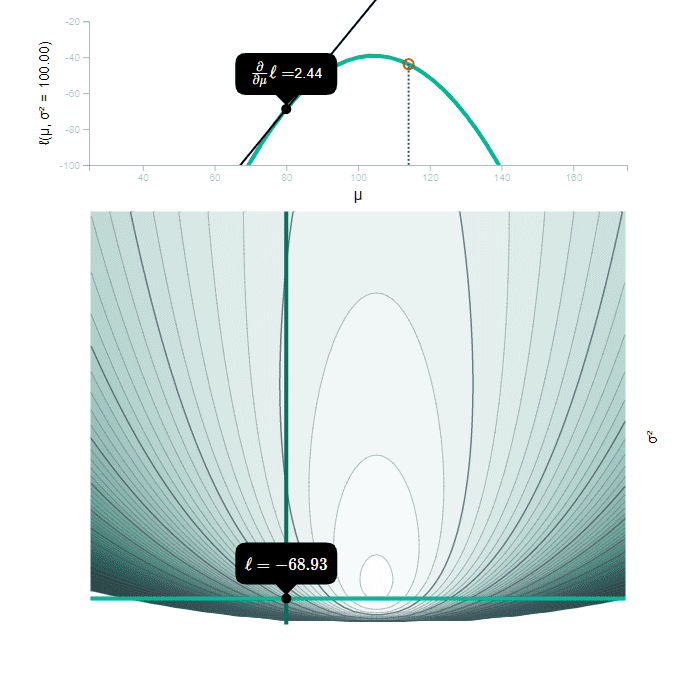
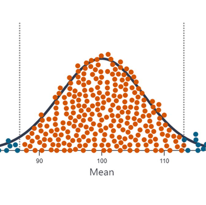
Maximum Likelihood
An interactive post covering various aspects of maximum likelihood estimation.

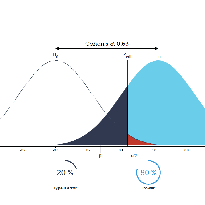
Cohen's d
An interactive app to visualize and understand standardized effect sizes.
Statistical Power and Significance Testing
An interactive version of the traditional Type I and II error illustration.
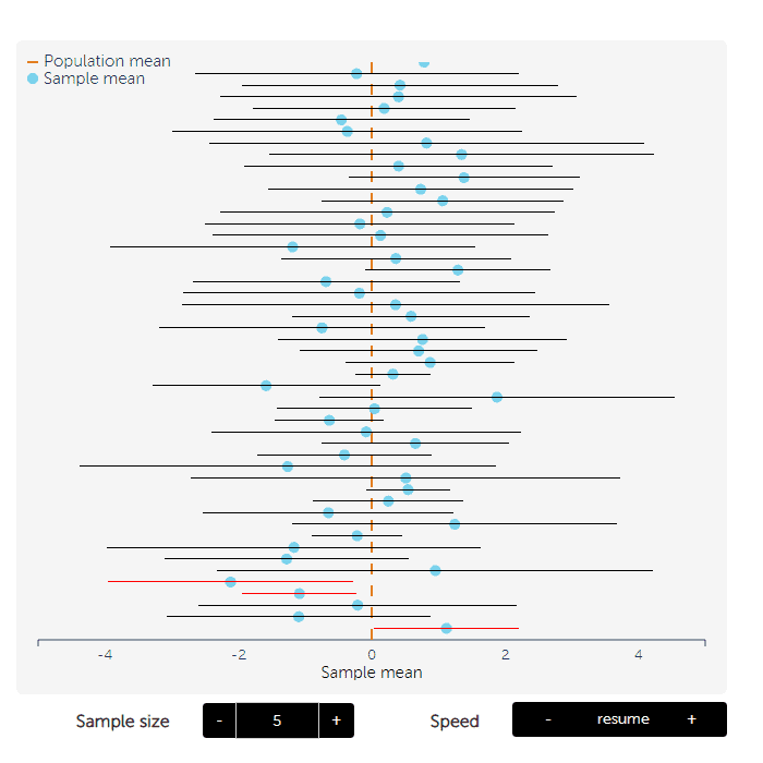
Confidence Intervals
An interactive simulation of confidence intervals
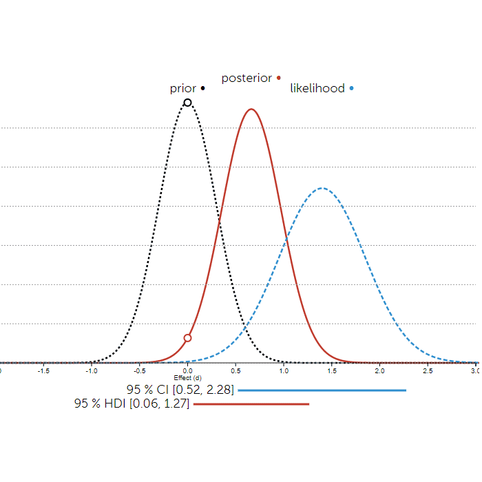
Bayesian Inference
An interactive illustration of prior, likelihood, and posterior.

Correlations
Interactive scatterplot that lets you visualize correlations of various magnitudes.

Equivalence and Non-Inferiority Testing
Explore how superiority, non-inferiority, and equivalence testing relates to a confidence interval
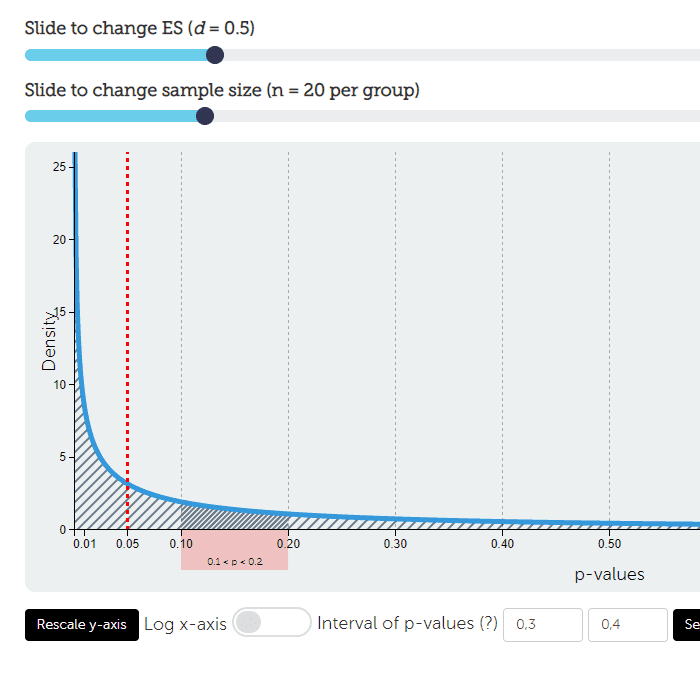
P-value distribution
Explore the expected distribution of p-values under varying alternative hypothesises.

t-distribution
Interactively compare the t- and normal distribution.